Have you ever marveled at a black and white photograph? Did it captivate you and present a mood and setting? We all appreciate the work of Ansel Adams as an example.
An important element B&W photographers are keenly aware of in their composition is the use of positive and negative space. This is equally important to artists creating contemporary works and to art lovers & collectors trying to define why they like or dislike a piece. In this post, I will look at this from my artist perspective and you will learn its importance to me and other art you come across to appreciate but can't always put your finger on why....
I will start by defining these terms but simple examples will better serve In understanding. The positive space refers to the compositional elements within a painting. The negative space refers to the area around these elements. Artists often will use these concepts to construct their center of interest for the viewer. Seems rather abstract in words, look below:
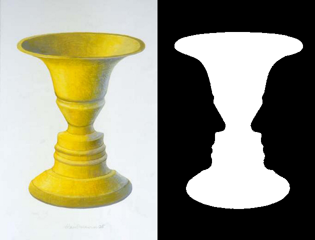
Take the simple vase on the left. The positive space is the vase itself while the white areas are negative space. Now look to the right image of the vase. Again, the vase outline in white is positive space while the black is negative space. But do you see something else?
Look carefully, if you concentrate on the black space, you should see the outline of two face profiles across from each other. If you do, your brain is conflicted and flips between the vase and heads. The interplay of positive and negative space creates in this instance an optical illusion.
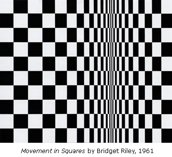
Some artists take advantage of that tension in their artwork like Bridget Riley below:
However, the use of positive and negative space can provide compositional context and balance to paintings. This is the more relevant side to me. Look at the painting by Piet Mondrian below:
This famous artist is a great example of providing balance between positive and negative space. Notice the white negative space is harmonized with the bold black lines and bright colors on a non-dimensional presentation. It seems simple, like "I could do that"! Perhaps as a copy-cat you might but the artist implicitly could visualize this balance and be one the first line of abstractionist (talking 1920's btw).
This use of space acutely confronts me in my work on large acrylic panels. My more monochromatic pieces best illustrate this struggle for balance. When I start this kind of piece I lay a roll of white paper under the clear acrylic. At this stage, I know the final layer of many preceding image layers will be white (when I flip it over to reveal the painting!). But in the creation process, I want a white background (negative space) so that as I paint individual layers (positive space) I can stand back to study & contemplate this balance during each progressive step (as the paint dries). Using this reverse painting technique does not allow for rework and so this understanding is critical to success or results in wasted panels to be trashed.
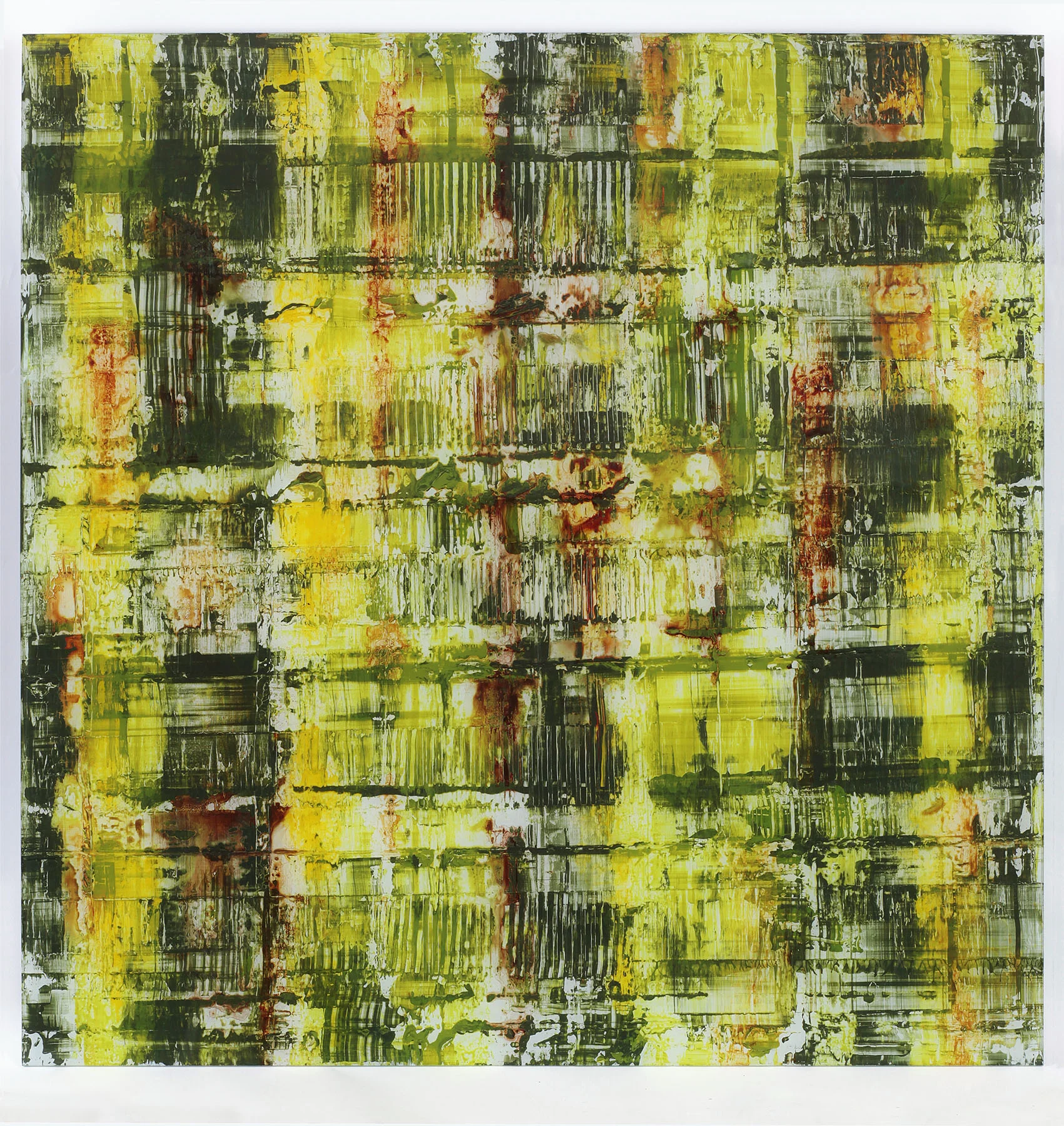
This is the hardest part of achieving success, stopping myself and not going too far. While I don't know until I flip the panel to see the layers behind the glass, if I don't get this space balance right, the rest does not matter. Here is a recent piece where I believe this balance is achieved below:
This is fairly large, 4ftx4ft. The white & yellow areas provide a balance to the darker greens. See the interplay of white that gets lost on this distance shot, below on a close up:
Below is how I view it through my artist's lens; converted to black and white. Should look pretty good with or without color...
Often abstract and even contemporary art gets a bad rap. Many times art looks like a splash of color thrown on a canvas....and it looks terrible and cheap to us! An element that often follows my tastes in liking a piece is the balance between positive and negative space. After all, this is non-representational art so this attention is too often absent but critical in my opinion. Next time you look at art you like, stop to consider this element in a new light.


